Followers

Monday, January 31, 2022

Photography: The Final Outcome

 Here I show the final outcome of my three week photography course on Media Project I. 


Those pictures I consider the best one's of many that I took during this three week. I'm happy with the outcome. They express different photography techniques that I have learned during my course. Three of my pictures are powerful, energetic and colorful. The rest is toned down. I like that contrast. The most enjoyable part of the course was 'painting with light'. I like the fact how the outcome surprised me and we can see that on first two pictures at the top. During my photography project I had my eyes and mind wide open. I consider myself to have 'good' view on the world surrounding me. I have seen imperceptible. I changed my perception of the world. Also I went beyond my comfort zone by photographing people I don't know. I have never image I will be able to do that. I finish here and I hope you enjoy my pictures.


Sunday, January 30, 2022

Photo editing

Today I'm going to edit my final images. I will be doing it by using post-production techniques and using Adobe Lightroom tools and presets. First I would like to focus on further module - Develop. 

The Develop Module is Lightroom's second-most-used core module. Many photographers will rarely, if ever, move on to additional modules after this. Following Naryskin (2018) :"if you're using Lightroom, it's likely that you got into it due of the Develop Module. It takes time to learn how to utilize and appreciate the Library Module. This is without a doubt the most important Module in Lightroom, and it is where you will spend the majority of your time. It features a suite of tools that are specifically designed for picture editing and are quite handy, powerful, and ergonomically put out.

Here I would kike to show how I practice with Develop module. On the left side panel we can find Presets tab. We can create, organize, import and export Presets on this tab. The left-hand panel also has basic Library Module tools like ability to switch between collections. I can automatically change the look of my image by it's color: Natural, Bright, High contrast. Then we can find Creative presets such as Cool light or Warm shadows. Here I want to share some effects:

                                                              Natural preset
                                                                  Matte preset

I like the outcome of this preset. Kind of vintage and old-fashioned picture.
                                                                Split tone preset

If I would like to go much deeper I can consider elements such as Color Temperature, Exposure, Contrast, Shadows, Texture, Saturation I can find tools for it on the right-hand sidebar. Also there I can find option black & white. With those tools I can let my imagination run wild. I change the setting by clicking on zip and move it from the center to the left or to the right in chosen setting. 

                                                                    Playing with Effects

                                                                   Black & White

                                                                     Color Grading

                                                                Original photo
 
                                                                 Split tone preset


Now I can export my image to the Desktop clicking right mouse button 

 In terms of 'painting with light' I will work with contrast and saturation to squeeze the color out as much as possible. 


Now I know how to use and what to do to change the look of my images. I discovered many options to achieve good quality of images. I decided to set up Split Tone preset on one of my pictures. I'm inspired by photos of Eugene Atget and his sepia Paris collection. I think it looks interesting. I like old-style, vintage photos. Also I decided to set up one picture black and white. Then I worked with Conrast and Saturation.  In the next blog post I will show the final outcomes. 


Sources:

https://photographylife.com/lightroom-modules-explained

https://lightroom.adobe.com/


Friday, January 28, 2022

Digital Workflow


In today's class we have discussed the editing software. We had an introduction to Adobe Photoshop Lightroom. Lightroom is an online photo editor. Adobe Lightroom is processing software developed by Adobe Inc. Importing, saving, viewing, organizing, tagging, modifying, and sharing vast amounts of digital photographs are among its key functions.


White balance, presence, tone, tone curve, HSL, color grading, detail, lens corrections, and calibration manipulation are among the editing operations available in Lightroom, as are transformation, spot removal, red eye correction, graduated filters, radial filters, and adjustment brushing. The software's name is derived from darkrooms, which are used to prepare light-sensitive photographic materials. (Adobe 2022). 

The digital workflow is an important aspect of photography. All of these steps are taken to improve image quality, speed up processing, and assure consistency while working with digital photographs. 


How I work with my digital workflow?

First I set up an theme and capture images. Then I transfer them from camera to the computer. Then is to sort pictures and give then names. Later I evaluate and rate it. After importing our images we can organize them using flags, stars and color labels. Next step is to edit and optimize images.  Important thing is to be sure I make copies and for example save it on Google Drive. Finally is to publish images. By doing all of this steps I can be sure I will achieve good quality of my project. Here I show the process:

Adobe Lightroom has modules that I should know. There are: Library, Develop, Map, Book, Slideshow, Print, Web. Then Navigator, Catalog, Folders, Collections, Histogram, Quick Develop, Keywording, Keyword List and Metadata. 

One of the important modules is Library. It is designed to assist in organizing and managing images. There we can find everything we need to find, import, sort and organize our photos. On the left-hand panel, there are navigation options. This panel allows to view all of the photographs in the current Catalog. We can also select a source Folder or Collection to browse through. Using the Folder tab to organize folders and physically move or transfer picture files. In addition, we may use the "Publish Services" tab at the bottom of the left-side panel to publish photographs to web services.

The image display takes up the majority of the Library Module. We have the option of viewing photographs in a resizable grid or one at a time. Above the Filmstrip is a toolbar with these and other view options . The Filmstrip has a few filter options, such as Flags and Color Labels. Toggle the filter bar with the " button to add more filters. It can be used as a robust search engine. We can search for photographs using the filter bar by specifying lenses, focal lengths, aperture, camera, keywords, and other parameters.

The metadata tool is on the right-hand panel. We can add keywords and copyright information to this section, as well as choose which metadata details to maintain. The right-hand panel also provides a few basic picture changes. Presets and basic White Balance, Exposure, Clarity, and Vibrance adjustments are all they have. 


Here I show the process of my digital workflow:

Once I opened Lightroom I click Import on the bottom left side and import pictures


Then I rate all pictures:

Then I apply metadata to my pictures and add copyright status, photographer name and contact info choosing Metadata taskbar on the right side

Then I can add key words to categorize and easily find my pictures in Keyword taskbar on the right side

Then I can export my images to another place 


I created new folder and I choose the best pictures I would like to edit and add them to my portfolio. 


To sum up Adobe Lightroom is a good software for beginners, in my opinion. If we take things one step at a time, using a professional photo editor shouldn't be too stressful. The most crucial step is to import our files, arrange them, and assign ratings and information to them. Then we may experiment with its presets and editing tools to see how different settings affect our photos. 


In the next blog post I will show how I work with tools such as Develop and presets to achieve the best quality of my images to continue work in digital workflow and post-production techniques. 


Sources:

https://lightroom.adobe.com/

https://photographylife.com/lightroom-modules-explained

https://www.digitalcameraworld.com/buying-guides/the-best-photo-editing-software


Wednesday, January 26, 2022

The City at night


In today's class we started to talk about long exposure photography and how to shoot street photography at night. Then we discussed on color theory in photography. We had a look at saturation, accent colors, contrast and light. Then we see examples how photographers use this. To begin my 'the city at night' journey I will first do the research and then capture my own images. At night, cities shimmer and come alive, making them a fantastic subject for photography. There are, however, many more limitations to work around, certain settings to employ, and, depending on what shooting we should have to push  camera to its limits. 
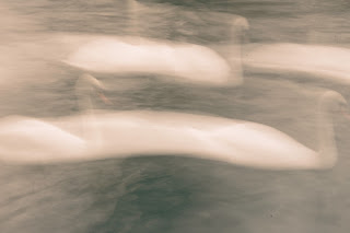
I want to start with research here about Michael Palazzo photographer, which in his portfolio has "Venezia by night" series of images. I'm looking at his work because I can find inspiration and he is a good example of night shooting. He describes himself: "I'm Italian by blood, an Architect by training, and Photographer by heart. A visual storyteller, weaving narratives through people’s movements and emotions."

                                                   Michael Palazzo - Venezia by night
                                            Michael Palazzo - Venezia by night
                                                Michael Palazzo - Venezia by night
                                                 Michael Palazzo - Venezia by night
                                                 Michael Palazzo - Venezia by night

In my opinion we can see beautiful contrast between light and the dark city. It creates peaceful and in the same time mysterious climate. Even though we can't see people around we can see that city is still alive and attractive by lights in it. 

As Palazzo says: "when I seek another definition for ‘peace,’ I never find any better description than ‘Venezia by night.’ Another Venezia appears at night when all the tourists are gone.". 

'Color gives emotion'
Color and light are strongly important in photography. The color of light in photographs gives viewers information about the image. Only the facts and information included within the generated frame are available to the viewer. The emotion that an image produces for the person viewing it is influenced by color. (Pete, 2021). 

Color is a reflection of light. It is formed by absorbing and reflecting light off a surface or through a transparent substance. The wavelengths of light that the human eye absorbs and processes from a reflected source are known as colors. When we see a color, we are seeing reflected light from a certain region of the spectrum.

Colors are affected by a variety of things in photography, including the time of day, season, light, weather, and camera abilities and equipment. A photographer must grasp the origins of colors and how they are perceived. Also be aware of how light can change color and shape.

We can highlight color harmony, complementary colors, analogous colors, monochromatic and then color contrast and white balance. 


White balance

A digital photograph's white balance is adjusted to make colours appear more realistic. It's a technique for neutralizing a photograph or making white appear white. In bright light, a photo of snow, for example, can appear bluer than it actually is. To avoid the blue cast, we use post-production tools to remove it. Tools like Adobe Lightroom, Photoshop, and similar picture editing programmes allow more control for genuinely correct white balance.

The color of light is commonly referred to as color temperature. The temperature at which a black body an object that totally absorbs all waves of light — emits radiation of the same hue as any given object is known as color temperature. Kelvin is a unit of measurement for color temperature (K). The "colder" or whiter the light is, the higher the number. The hue of the light emitted follows a roughly linear progression of red orange, red yellow, yellow white, white, blue and white.


                                                             white balance adjusted 
  

As I am passionate about cooking and food I set up myself the theme for night shooting 'Restaurants Windows". Here I add my images and add EXIF details, then I add reflection.

                      Canon EOS700D f/5.6 1/50sec ISO 6400 focal length 55mm

This photo I consider the best one. I like the warm light in it. I captured people during the dinner. I can see wonderful atmosphere in this place. There is a purple light in it. In my opinion light in restaurant plays important role. It can attract guests and make them feel at home. It reminds me about Danish term "hygge". 


                           Canon EOS700D f/5.6 1/100sec ISO 6400 focal length 55mm

This photo is colorful. Concept of this restaurant came from Argentina. Looking at this window I consider this country and culture colorful and warm. A lot is happening in this picture. In my opinion decoration and design play vital role of a restaurant. And here we have proof of it. Also here I add screenshot from Google Images where I simply entered 'Argentina'. It makes me feel I want to go and visit this country. 

                                                                  Google Images screenshot


                                         Canon EOS700D f/5.6 1/13sec ISO 6400 focal length 27mm

Here I captured restaurant chef. I can see reflections in the window. Again warm light. Then there is the light on the floor. All of these elements makes this photo looks surreal and because of that the image looks interesting. 
                                  Canon EOS700D f/5.6 1/30sec ISO 6400 focal length 25mm

I like the fact a woman looks exactly straight to my camera. This bar/restaurant is called 'Audrey'' and it reminds me about British actress and humanitarian Audrey Hepburn (born 1929). Also I like the pastel colors in it. Then we have warm light in it. Pink ad grey colors they are complementary and I wanted to capture it here. Also when I look at the design I think about 50's. 

                         Canon EOS700D f/5.6 1/50sec ISO 6400 focal length 55mm

My favorite place in Leicester. 'Sonrisa' Argentinian restaurant is one of the greatest place to go with friends to eat, spend fantastic time to the accompaniment of southern music. 'Sonrisa' in Spanish means 'smile', so we can expect we will have it while being there. We can discover open kitchen and see how our dishes are prepared. For me it's a kind of 'show'. For me this image is a little bit too dark, I could work more with light here. Then I don't really think that capturing that 'road sign' on the left side was necessary. It was quite challenging to capture this window because it was very big and I was very close to it. 

                                Canon EOS700D f/5.6 1/15 sec ISO 6400 focal length 55mm

Here I consider this restaurant windows as a 'mise en scene' and it is like a frame taken from the film. Lamps and the light, people inside, color, decorations. Everything looks like planned before. I could come even closer to the window to show more details. I like the idea that we are going down the boring and greyish road and then suddenly we have live in it. 

Looking at those pictures we can discover and be surprised how wonderful places we can find in Leicester city. Fantastic place for visit, eat and relax. I think I'm lucky enough to live here and having all of this places at my fingertips. My reflection is to do more and more pictures and practicing with luminance to shoot the best image. Overall I'm happy that I could go outside and capture some of nice pictures with my camera. In the next blog post I will show the process of editing my images. 


https://www.blog.motifphotos.com/photography-101-color-theory-in-photography/

https://medium.com/the-coffeelicious/a-photographers-guide-to-color-temperature-6bbc882d1524

https://www.jamesmaherphotography.com/night-city-street-photography/#Street_photography_at_Night_8211_Introduction

https://www.visitdenmark.com/denmark/highlights/hygge/what-hygge


Final Thoughts

As my last semester comes to a close, I would like to share my thoughts. The two main things I worked on were an essay and a media project. ...